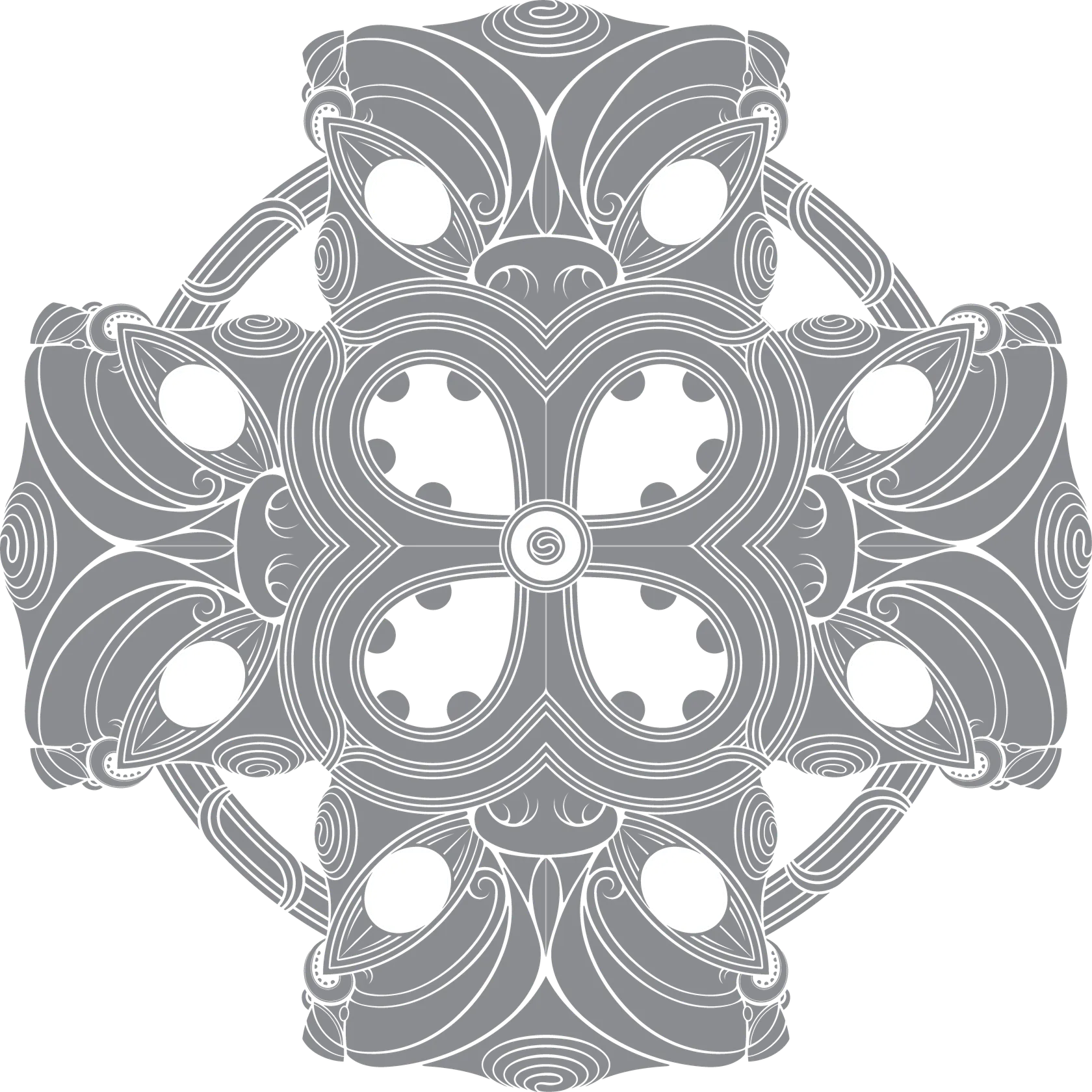
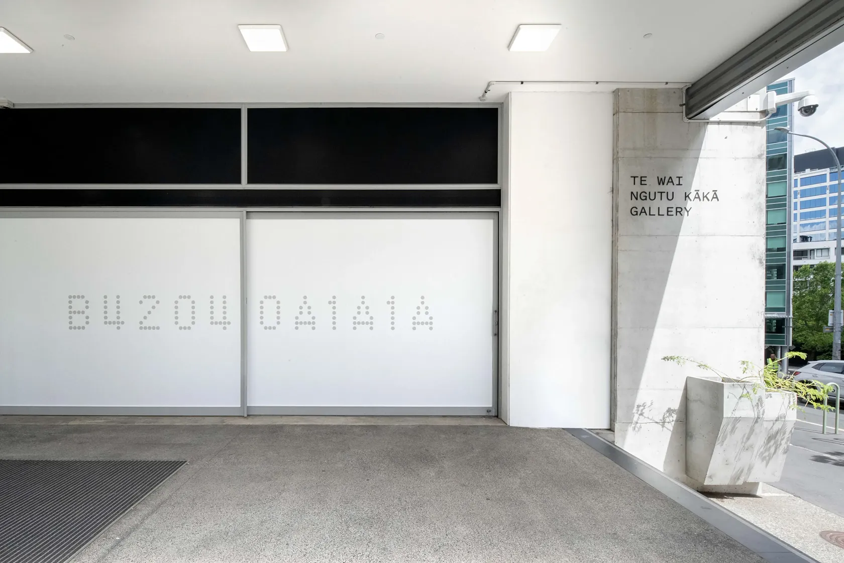
The visual identity for Te Wai Ngutu Kākā was developed in 2021, growing from the name gifted by Ngāti Whātua Ōrākei to the gallery formerly known as ST PAUL St. The new name draws attention to the now-rare ngutu kākā plant, once abundant around the Tāmaki isthmus. Although small, ngutu kākā is a precious signifier of the complexity of the natural world; as a tohu for the gallery, it’s a reminder of art’s ability to examine the world’s intricacies.
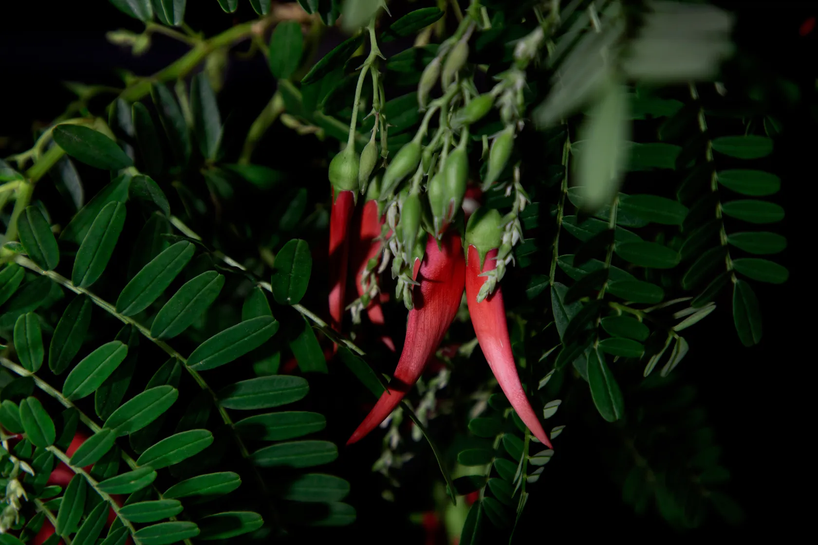
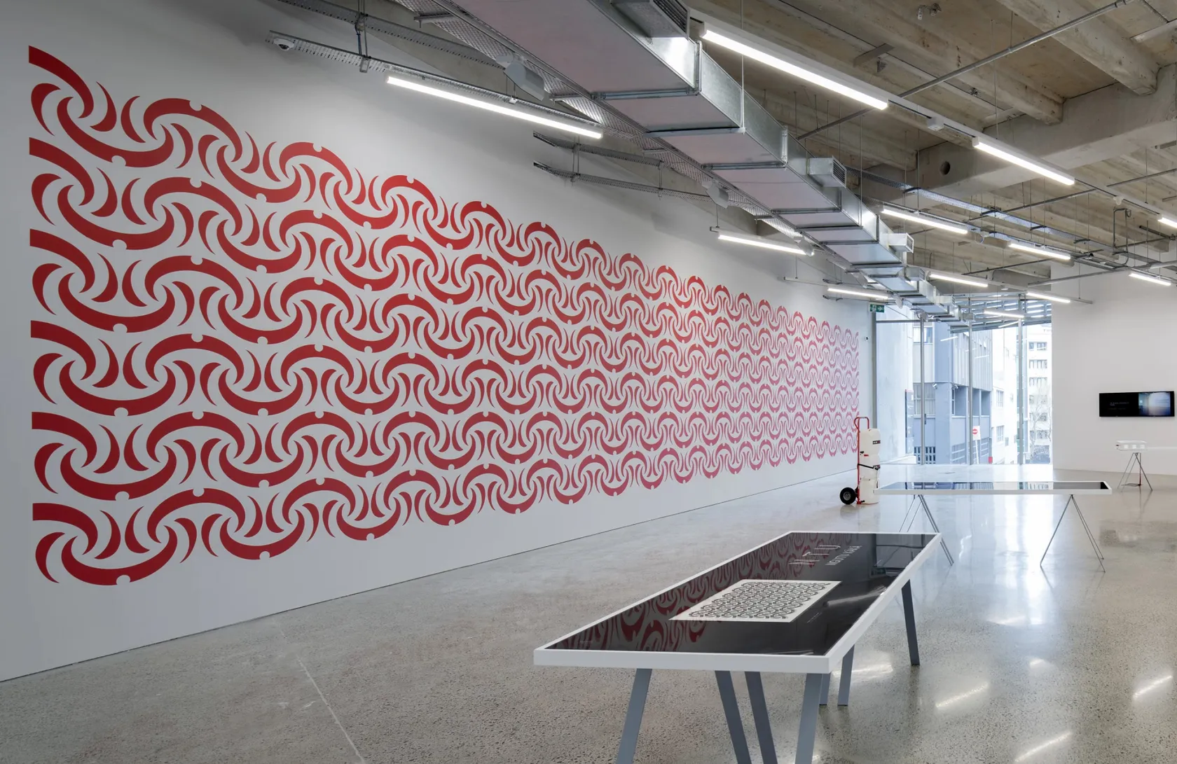
The flowering of the ngutu kākā signals a seasonal shift. Its growth and flowering respond to wider environmental cycles shaped by changes in light, temperature, and the movement of the earth through the year.
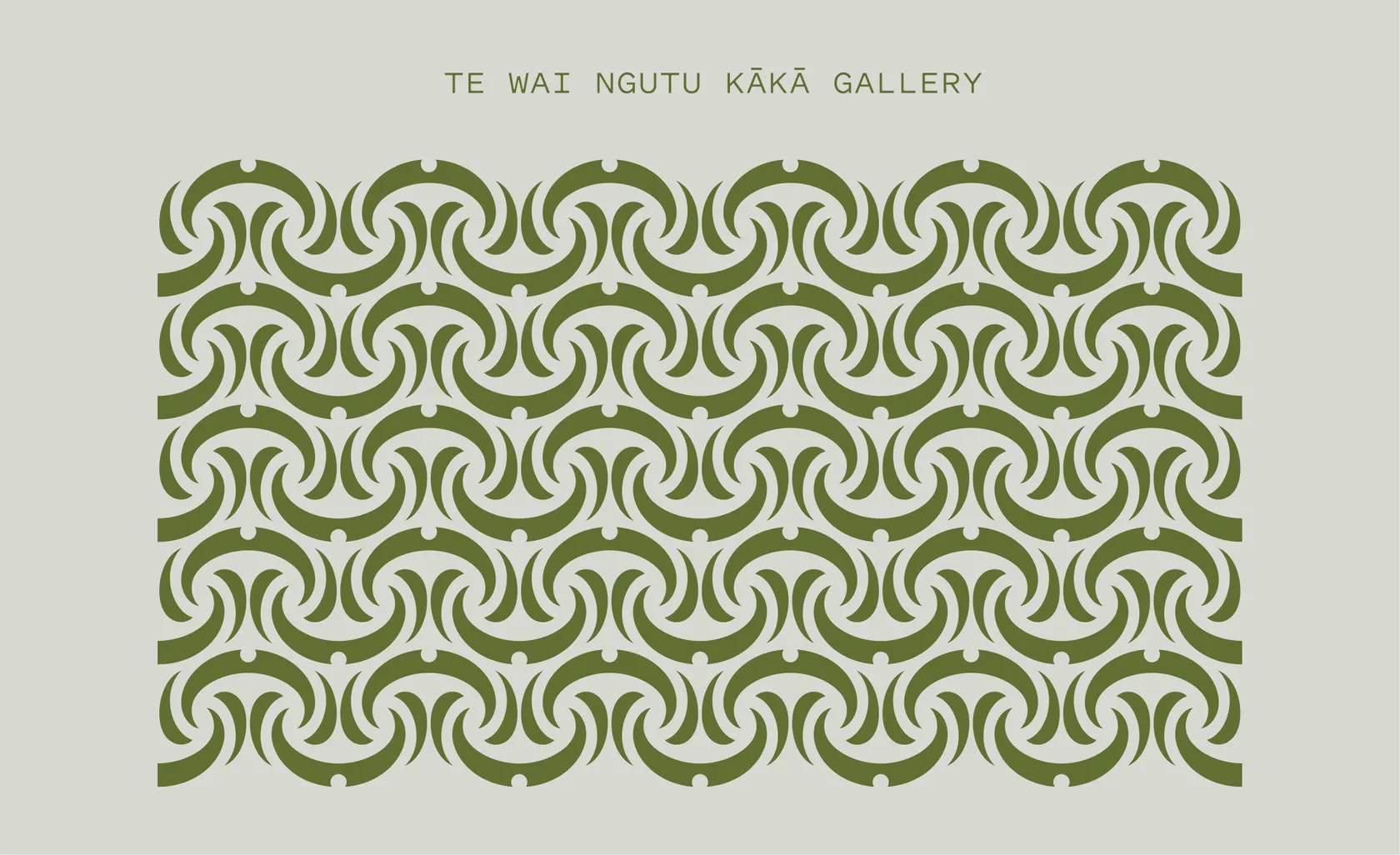
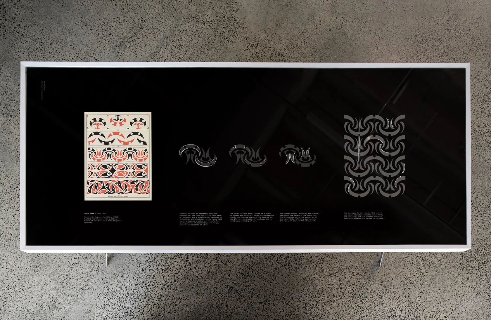
Like all living things, ngutu kākā is influenced by these seasonal rhythms. The pattern reflects this through the introduction of the kape, one part of a repeating pattern called kaperua. Derived from the framing form of the eyebrow, the kape is used in toi Māori to reference perception, observation, and the development of understanding. The kape wrap around the beak-like form of the flower, bringing seasonality, perception, and change into a single composition.
At the centre of each kape, the circular negative space forms a pītau – a reference to the tightly coiled fern form before it unfurls. Associated with emergence, growth and potential, the pītau is carried through the pattern as an absence rather than an applied motif. Together, these elements connect cycles of growth in the natural world with the ongoing development and renewal of knowledge.
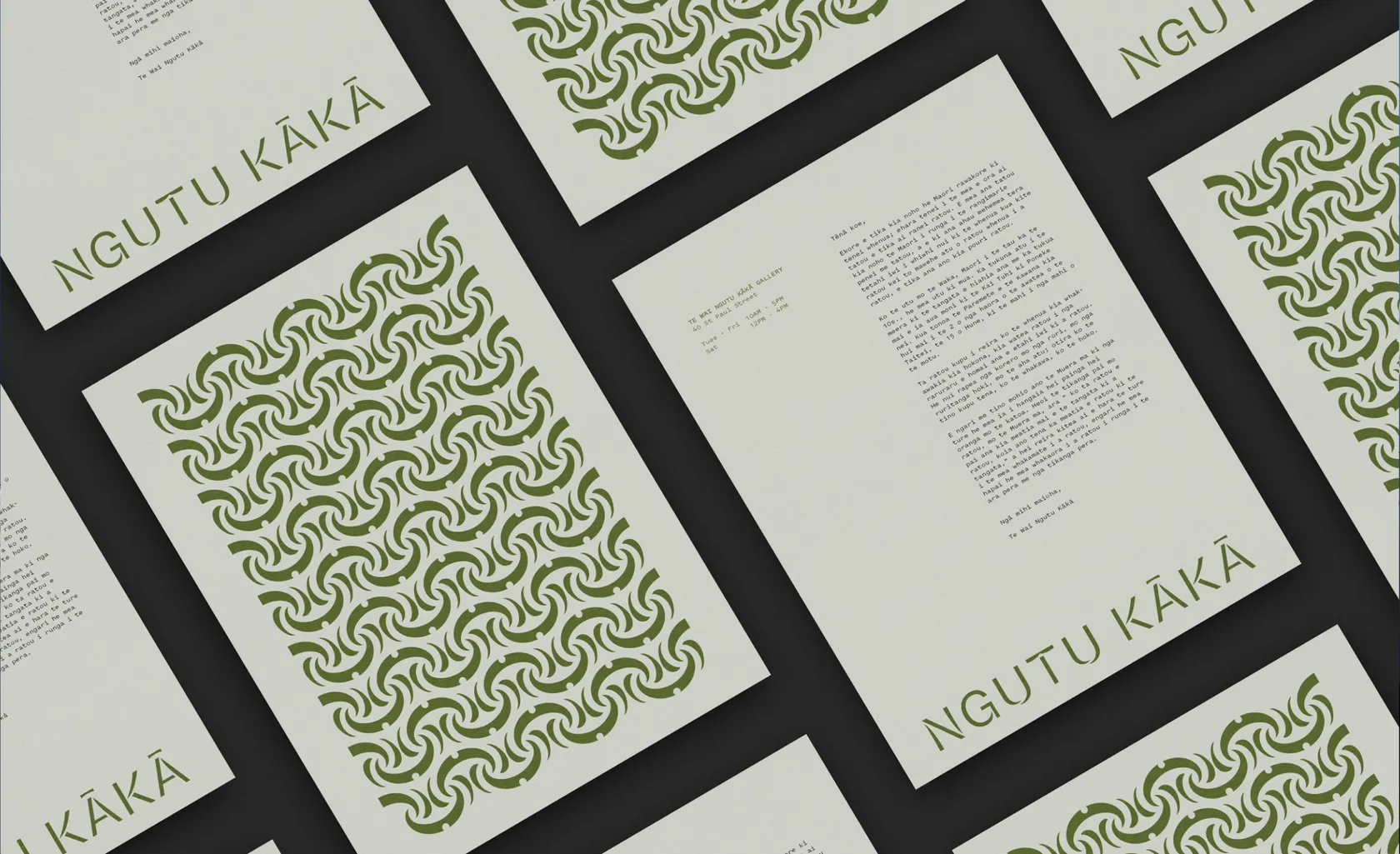
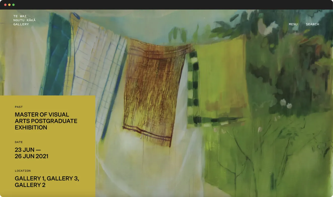
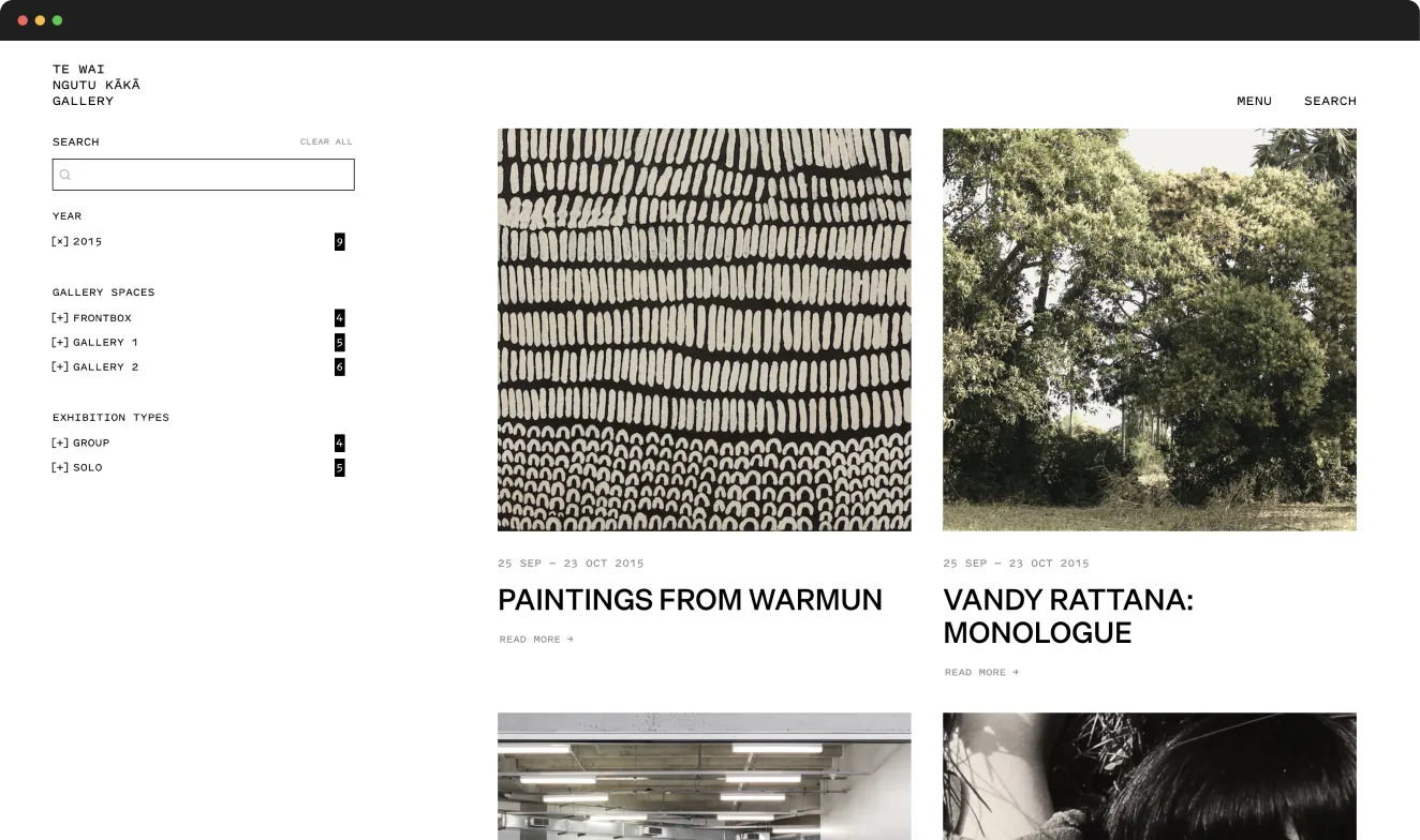
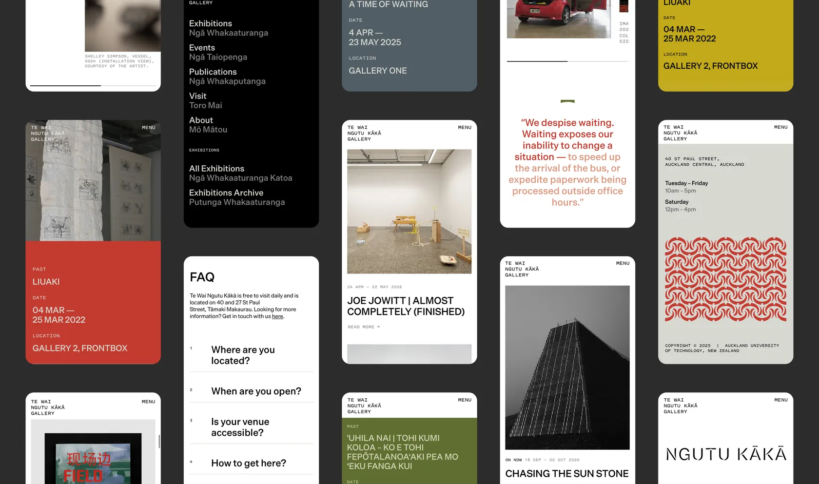
We worked with digital studio Wildlabs to build a website for Te Wai Ngutu Kākā that would, like the pattern, envelop the gallery’s exhibitions and content in the concept of the ngutu kākā.
Colour operates as a tohu. The site’s palette reflects the changes and transformations that the ngutu kākā undergoes across the year. The colours consider exhibitions as seasons and each is given its own chromatic moment, with colour selected in response to the exhibition’s particular character and context. Black, white and grey form the site’s underlying canvas, creating space for the exhibition colours to register while also recalling the concrete materiality of the gallery itself.
A diverse and flexible grid system was designed to host the wide variety of exhibitions, events, and other content. The decades-deep archive is a special part of the gallery, extending back to 2004. On the website, the archive was carefully considered to be easy and enjoyable to navigate, ensuring past exhibitions and ideas remain present, accessible and connected to the gallery’s ongoing programme.